Thursday, 12 February 2015

Magazine Cover Analysis #4


This is a magazine cover from Total Film for the 2005 film King Kong. The cover image is of the films 2 main leads, the man with his arms around the woman as if protecting her from something unseen to the audience. The characters positioning is telling for the audience, the man protecting the woman reinforcing the gender stereotype of woman acting as the "damsel in distress" with the man being the brave hero. The characters costumes also tell the audience that the film is set in the past rather than modern-day as they are clothes you would expect from the 1930's rather than 2015. Having the female character dressed in all-white connotes vulnerability and innocence and tells the audience she is a protagonist rather than the films villain, although anyone with even a passing knowledge of films should be fully aware who the villain is in a film called King Kong. The mans costume juxtaposes the woman's being dark in colour, reinforcing the idea of his character being brave as he stands out more and does not wear any vulnerable white colours. This would be why the image used shows the characters in a long-shot rather than a close-up to show their costumes to the audience in order to give extra information about the film.

The background of the cover is typically dark and mysterious, drawing focus to the characters rather than the setting. If the audience looks closely enough they can make out the characters are standing in some sort of cave, alluding to the films exotic setting but not giving too much information away. The lack of any clues as to how the iconic King Kong character will look in the film is intentional, and something that most of the films promotional campaign excluded as well. This raises enigmas and makes the audience want to watch the film to see the giant ape. This films main USP would be the fact that it is a modern reboot of a classic monster film, allowing for better CGI and visual effects to create a more realistic monster, therefore not giving away that part of the film works to entice audience members to go and see the film to find out.

The text used for the film is large, capitalised and boldened, drawing comparisons with the magnitude of the films antagonist and drawing attention of readers to the film. The use of yellow on the cover for the article titles and the King Kong title stands out against the mainly black background to again, draw readers attention and make the magazine stand out in shops against other magazines.

Character Photos


These are 2 photos we took of our antagonist to use in promotional material like our film poster and magazine cover. We took the pictures in a cupboard at school so that no natural light would interfere with the pictures and the camera would only pick up what we used the flash on. It was also easy to Photoshop these pictures and make a cut-out of our character with a background that was full of colour, rather than black like our characters costume.

Magazine Cover #2


This is our final magazine cover. We designed it on paper, then using Photoshop we used several of the unique effects available to add a menacing effect to the front cover. The audience would feel threatened by a faceless antagonist, as this doesn't allow the audience to feel for the antagonist they don't get to relate to him and in this way will feel frightened by his presence. The red colour in the title links to blood which in our trailer is threatened but not shown. The faceless antagonist anchors the text title stalker and is the main selling point of this issue of Empire. The bright colours used in the other articles helps show the audience what else is in the article as well as advertising other films. The text used is big and bold with certain words emboldened to make them stand out. The barcode and price are both located in areas where they are commonly found in real life.

The skyline and main magazine title are both big and bold at the top of the page, with the 'exclusive preview' suggesting to the audience the magazine will have articles and information that no other magazine will have and this would attract more readers, as the audience are constantly looking for something that gives them more information especially if its about something they really enjoy like films. The main title 'Empire' is a major magazine company with a large readership of about 800,000 people, this means films featured on the magazine are likely to be popular, the magazine is also well respected making film reviews important. The puffs shown on the front cover are shown big, they offer free things, this attracts a younger audience, and its bright colours draws the eye especially on a dark background. The smaller articles along the right-hand side of the cover are from recent films Nightcrawler and Gone Girl these films are both psychological thrillers which links to our film as we kind of wanted this feel to our trailer, there is a clear thriller film genre in this months issue of Empire. The 'exclusive interview' at the bottom of the magazine draws the audience to read further into the magazine as two of the movies stars are being asked questions, the audience would want to know more about these actors, so they can get to know them better and it humanises the otherwise major celebrity actors.

Evaluation Activity 1: In what ways does your media product use, develop or challenge forms and conventions of real media products?

Our magazine cover is conventional when compared to other magazine covers that we have seen from our analysis earlier in the year. The font for example is  big, bold and contrasts against the background. However the font used on the main article 'Stalker' could be considered unconventional as unlike other fonts from other magazines this one is not bold, it is written in the same font as it is on the trailer, linking the trailer to the magazine cover. It stands out because the letters are so spaced apart. Also the title itself 'Stalker' is an enigma, as the audience has no idea who the main image is of, where conventionally they would normally show the face of a character, mostly the protagonist, on our magazine cover we haven't gone with that and decided it adds mystery as well as menace to the character as the main title would suggest a threat exists and the curiosity of the audience would draw them in as they would want to learn more about the film and what it is about.


The layout for the magazine is conventional, when compared with other magazine covers such as the Skyfall and Captain America Empire Magazine covers. The layout consists of several pictures or articles surrounding a close up of a films main character in the centre, and there would also be bright colours as well as puffs and exciting language used such as 'exclusive'. These puffs are conventional and would attract the reader to purchase the magazine. Coverlines emphasise the theme of the magazine cover which in this case would be thrillers. The picture in the centre of the cover is unconventional compared to the other covers I have looked at as the background is dark and cloudy and there are several enigma's that could intrigue the audience. As a whole I believe that our magazine cover is conventional when compared to other covers, it generally doesn't change the main features you would expect to see and in a way it draws the audience further in as the unknown image and the effect of 'Stalker' adds fear to the cover but also intrigue.

Questionnaire Analysis

These results show that the majority of people we asked were between the ages of 16-20; also it shows that most of the people we asked were male. We decided to set our age certificate to 15, so the questionnaire results are still helpful to us as only 5% of the people we asked were under 15. 

When deciding our location the questionnaire results helped us massively, as we were unsure on where the film would be located. With 40% of the people saying to use a house, we decided to use that. Also we agreed with 20% of the people as we chose to film some of our shots outside near a park.

The questions on the antagonist also helped us a lot. Our group was unsure whether to make the antagonist visible or non-visible. The results of the question swayed us in favour of visible, with 65% of people saying so. Also the results of the question on antagonist characteristics helped us show what the character will be like in the trailer. In the trailer the antagonist is seen to be creepy, mentally unstable and intimidating.

When asked what their favourite horror sub-genre was the majority of people said thriller, so we decided to make our film a thriller. Before we recorded this questionnaire, we were unsure whether to do a thriller or a psychological horror.

When we asked what people's favourite film was the most popular answer was Taken. Taken's genre is a thriller, which is going to be the genre of our film, so with it being people's favourite film it shows the thriller genre is fairly popular.

The question that asked what you expect to see in a horror film helped us a lot. The main answers were murders, suspense and jump scares. In our trailer we will try to use all of these things throughout. We will try to create suspense by using creepy music; the creepy music will also link with jump scares. In the trailer the main antagonist is a serial killer so there will definitely be murder shown in our trailer.


So overall the questionnaire results were very helpful and they helped us decide many things that we were unsure about beforehand. The questionnaire helped decide the characters, the genre, the location and what happens in the film. So, carrying out this questionnaire proved to be very worthwhile.

Magazine Cover Analysis #3


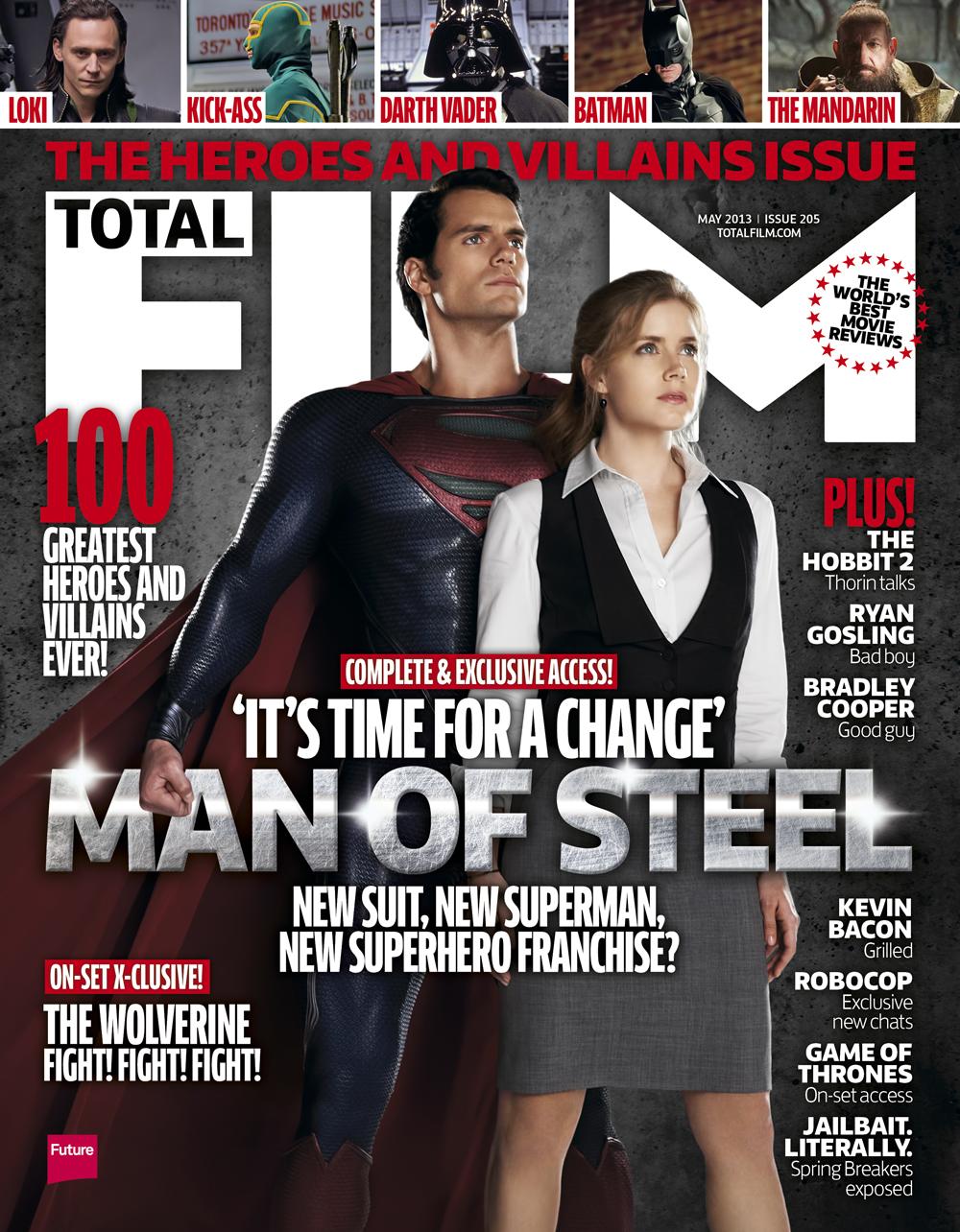
This is a magazine cover for Total Film magazine that shows a still from the Superman film, Man of Steel. The image used is of Superman standing in a heroic pose behind Lois Lane, his love interest from the film. The cover works to make Superman seem as powerful as possible, with his central position on the cover showing the audience his importance and the 'standing tall' pose he is in making him look masculine and strong. His position in the image, standing behind the woman shows him to be protective of her, reinforcing a "damsel in distress" stereotype that is common to the superhero genre. This is also demonstrated through his height advantage over Lois Lane which shows Superman to be the dominant character.

The iconic costume of Superman is also shown to make it obvious to the audience that this is a superman film which may not be so obvious just from reading the films name "Man of Steel." This informs the audience of the genre to draw in their target audience of superhero genre fans. In comparison, Lois Lanes costume is plain and colourless, opting for a boring palette of black, grey and white. This works to make Superman stand out as the main character but also makes Lois Lane seem to be the representation of the audience in the film i.e an ordinary person with an interest in an extraordinary person.

The magazine cover also places the characters ahead of the magazines name which highlights the films importance and makes the audience want to read about the film to see what makes it more important than the magazine itself. The characters are also set against a plain grey background, which makes the characters the audiences focus and also draws comparisons with steel and strong metal like the films name alludes to. The films name is also written in a grey text and is centralised on the cover and made bigger than the rest of the text, also making it the most prominent to readers to entice them into wanting to read the magazine.

Wednesday, 11 February 2015

Magazine Cover


This is the initial draft of our magazine cover we have created for our trailer. We used inspiration from real-life film magazines to help design our own and make it look realistic. We opted to make our antagonist the focal point of the cover as we feel that the look of the character will create enigmas for the audience and will draw attention to our film.

Friday, 6 February 2015

Film Poster


This is the film poster we have created for our trailer. We went for an overall dark tone to the poster to let the audience know the genre and atmosphere they can expect from the film. We think making the Stalker character the most prominent in the poster and surrounding the character in darkness adds an enigma of "who is the stalker?" that audiences would want to see the film to find out. The poster follows the dark, threatening theme from the trailer and magazine cover, the darkness also helps set the genre for the audience and this helps draw people in to watch the film. The main images in the poster are from the trailer or from other productions that we have produced and shows the main actors as well as the main antagonist in the most prominent image, this suggests the film will mostly be set around him. The main title to the film is set in a large font at the top of the page this gives it prominence in the poster and because it is in a white font the word stands out far better than most of the imagery. The tagline "Wherever you go, he"ll be watching" is threatening and directed at the audience, this makes it more personal and draws the reader in. The poster also has the main credits for the film which can tell the audience who produced it and who is starring in the film, this information is vital as a reader might want to know who is in the film as some people only see films if they have a certain actor or actress. As well as this the poster contains the release month and year which gives an idea of when the film will be released. We have also positioned the 'company' logo in the bottom corner, this is to tell the audience who the production company is and this can inform the reader what the film budget is.

Our film poster had initially been simply the image of the main antagonist on a black background with the film title 'stalker' at the bottom. however over time we added film credits to the bottom , this was brought in from our trailer. Along with this we added several different images to the main image, this was to show the audience the various different characters in the film . The black background we added to give the idea of what the film was about, as from this the audience can probably infer the idea that the film is a horror and maybe even a thriller. The film title has remained in the same position throughout production, we felt that most posters we had seen had their titles at the bottom, this helps draw the audience and with our title 'Stalker' it links to the main image and genre.