1) Questionnaire Evaluation - explain your findings and how this has influenced your film trailer
2) Title Research of films in your genre then create practise titles and explain what is effective and why
3) Sound Research
4) Online Tutorials to help with the filming and editing
5) Animatic Storyboard
6) Stereotypical props and character types featured in the opening - explain that the antagonist photos featured in the trailer are conventional as the detective often looks at the suspects. The antogonist is a stereotypical representation as he is a convicted criminal, male, middle-aged, serious and intimidating etc.
Monday, 8 December 2014
Thursday, 4 December 2014
Thriller Genre History

In the 1940's and 50's, Alfred Hitchcock continued producing
suspense thrillers such as the Oscar winning film Rebecca which is about a
women in danger from her husband. During the 50's the use of technicolour
filming techniques became more widely used, Hitchcock began to use it in his
films during this time period, he produced Strangers on a Train in 1951 which
was about two train passengers who both staged a series of murders trying to
outwit each other.
.jpg)
In the 1960's the violence that appeared in thriller films
increased rapidly with the release of Peeping Tom, with Carl Boehm as a
psychopathic cameraman the film was released prior to Hitchcock's Psycho. After
Hitchcock produced the thriller Psycho, which at the time stunned and
frightened audiences for its graphic deaths and tension, the film itself is
about a loner mother-fixated motel owner who kills the guests at his motel. Spy
thrillers also began to appear, films like James Bond were very popular especially
during this time because it was the height of the Cold War.
.jpg)
The 70's and 80's had spy films scattered through them and
most of the James Bond films were released during these decades. The industry
also see's the last Hitchcock film as he died in 1980, he released one of his
last films in 1972, it was called Frenzy and it made nearly $12 million. These
years also saw rapid increase in the number of slasher films and films tended
to be far more violent as the industry began using improved makeup and special
effects techniques.

The 90's and films today have seen a wide range of
thrillers, there have been several films based on thriller novels, most
famously by Stephen King. The 90's was an era of obsession based films with a
stalker usually following or becoming obsessed with a certain character an
example of this was The talented Mr Ripley. There was however another theme
throughout the 90's and this was the hunting down of serial killers, the most
famous of which is Silence of the Lambs, which received best-picture in 1991,
Seven was another famous thriller of this decade. Since then the thriller genre
has started to reuse elements from previous films and add more violence and
brutality, an example of this includes The Last House on the Left.
_poster.jpg)
Shot Types in our Film
This is a list of some of the shot types which will be shown
in our trailer, we will try to use a range of shots throughout.
Over the shoulder shot- This shot will be used when Chloe is
sitting down watching the news report, the over the shoulder shot will show the
TV and it will tell the audience that she is watching the report.
Close up- We will use this shot when we are showing the
expression on Chloe's face, this will be when she is frightened due to the
lights going off.
Extreme close up- This will be shown when the antagonist is
in Chloe's house. There will be an extreme close up of his eyes, he will be
seen to be very serious and intimidating which will link to his character.
Long shot- We will use a long shot when the antagonist is
shown to be following one of his victims, we will also use a long shot when the
antagonist is shown to be walking away from the scene with a knife.
Medium shot- This will be used when Thomas is doing the news
report. A medium shot is good for us because it helps us show his smart
clothing, indicating his reporter job, it also helps show the background, which
is important because we are filming live from the scene.
Trailer Billing Card
We have created a billing card to go on the end of our trailer to add to the realism and make it look like a genuine film trailer. We used the layout from the film Seven's billing card to help us design ours and make it look like the real thing.

Wednesday, 3 December 2014
Diary of Filming
-On the 30th of November we filmed for the first time.
- The weather was good, as there was no rain, this meant we
were able to film without any distractions.
- We were not able to film all of the shots
- We have filmed around half of the shots that we need to do
-We are going to look over the shots in the coming days and
see if we need to re-film them
- The rest of the shots needed are at a different location
-These shots will be filmed in the coming days
- We feel the quality of the shots are a lot better than
last years filming
- The camera quality is very good as we used a GoPro

This is Thomas Cunningham in our film, this is the scene where he is reporting in the news about the new dangerous convicts that has escaped the mental hospital. His costume was very good and he looks like a professional news reporter due to the suit and tie and the trench coat.
Script
Starts off near the
crime scene, where Tom is reporting the murders.
THOMAS: We are now reporting live from the scene of a murder
investigation. We believe that the source of this murder is from the recent
outbreaks from the West Park Avenue mental asylum.
PRODUCTION CREDITS
inside Chloes living room while she's watching the news
report
THOMAS: We would advise anyone within the area to stay
inside until the murderer is caught, the police have informed us that this man
has the potential to go on endangering the lives of others.
To the first murder outside under the bridge.
(long shot of a stranger being followed by the stalker.)
(reverse shot of the other end of the pathway showing
murderer walking off and showing the victim laying dead in the background)
TITLES- BASED ON A TRUE STORY
ALEX: Who is it? (shouting, while looking at pictures of
potential suspects)
(back to Chloe's living room face timing the detective/
boyfriend)
CHLOE: This stalker
person is really creeping me out Matt, when will you be home?
ALEX: I'll be a few hours, you'll be fine, don't worry about
it.
CHLOE; What was that?
ALEX: What?
CHLOE: I just heard something
ALEX: Don't be silly, i'll be home soon anyway stop worrying
CHLOE: Okay try and be as quick as...
ALEX: Chloe.... who's that behind you..
she turns around and lights turn off , Chloe screams
MURDERER: You better
hurry home. ( fade to black transition)
TITLES- STALKER
Monday, 24 November 2014
Targets this week for your group
1) Questionnaire Results
2) Script
3) Animatic Storyboard
4) Shot List
5) Mood Board
6) Diary of Filming and Editing
2) Script
3) Animatic Storyboard
4) Shot List
5) Mood Board
6) Diary of Filming and Editing
Production Logo

This is the production logo we have designed to add to the beginning of our trailer. The name J-RAT Media Productions comes from a combination of our filming groups names, and we thought it was effective and memorable.
Institution Research
These are the six major film institutions (The Big Six).
Film institutions are very important as they provide the money for films to be
made, and without them, no one would ever get enough money to make a decent
budget film. These companies also own studios, providing places in which major
films can shoot exactly what they want. The only problem with film institutions
funding a film is that they like to have complete control over the project, so
if you go to them for money your film may not end up being completely how you
originally planned. They are all about making money, and this stops film
advancing as an art form. However a lot of good films are made by studios and
the film business wouldn't be what it is today without these major
institutions.
 Warner Bros studios was founded in 1903. It was formed by
four brothers called the Warner brothers, and was one of the first companies to
make movies with dialogue in it. They also famously started the original
'Looney Tunes', as well as many more successful cartoons. Warner Bros have a very
wide range of films. They tend to make high budget movies, to make a lot of
money, and their films are shown around the world. Their films appeal to a very
wide range of audience as they make films from many different genres. Previous Warner Bros films include: 'Harry Potter', 'The
Departed', 'The Dark Knight', 'Slumdog Millionaire', 'P.S. I Love You',
'Charlie and the Chocolate Factory', 'Troy', 'Blade Runner', 'The Wrong Man'.
Warner Bros studios was founded in 1903. It was formed by
four brothers called the Warner brothers, and was one of the first companies to
make movies with dialogue in it. They also famously started the original
'Looney Tunes', as well as many more successful cartoons. Warner Bros have a very
wide range of films. They tend to make high budget movies, to make a lot of
money, and their films are shown around the world. Their films appeal to a very
wide range of audience as they make films from many different genres. Previous Warner Bros films include: 'Harry Potter', 'The
Departed', 'The Dark Knight', 'Slumdog Millionaire', 'P.S. I Love You',
'Charlie and the Chocolate Factory', 'Troy', 'Blade Runner', 'The Wrong Man'. Paramount Studios was founded in 1916 and is one of the
oldest film institutions. Steven Spielberg is a major partner with Paramount as
he is one of the leading film directors in Hollywood and this is a major
contributor to Paramounts success as he has many fans and followers who will
watch anything he puts out, making most of his films instant money makers.
Paramount are ranked as one of the highest-grossing film studios in the world.
As with Warner Bros, they make a very wide range of films which targets many
different audiences with each film. Paramount films include: 'Titanic', 'Transformers' 'Indiana
Jones', 'Iron Man', 'Forrest Gump', 'War of the Worlds', 'Mission Impossible',
'Shutter Island', 'Paranormal Activity' .
Paramount Studios was founded in 1916 and is one of the
oldest film institutions. Steven Spielberg is a major partner with Paramount as
he is one of the leading film directors in Hollywood and this is a major
contributor to Paramounts success as he has many fans and followers who will
watch anything he puts out, making most of his films instant money makers.
Paramount are ranked as one of the highest-grossing film studios in the world.
As with Warner Bros, they make a very wide range of films which targets many
different audiences with each film. Paramount films include: 'Titanic', 'Transformers' 'Indiana
Jones', 'Iron Man', 'Forrest Gump', 'War of the Worlds', 'Mission Impossible',
'Shutter Island', 'Paranormal Activity' .
It seems that many of the large film institutions that started right at the beginning of film
making are the most successful production companies in recent times. This makes
sense as they have had the most time to evolve and grow to what they are now,
giving the audience the best possible films they can make for us to enjoy.
Mood Board

This is our mood board, this represents what ideas we have
for the trailer, as shown we plan to have a kind of Scream inspired film now,
we have brought this in as we can easily access the locations we need, the
story revolves around the escape of a convicted murder from a prison. The
prisoner uses a mask to conceal there identity, which will add mystery and
suspense to the trailer as we can't relate to the antagonist and this makes him
appear inhuman and almost like a machine.
On the board we also have the weapon of choice our murder
will be using, as we have researched we have seen that each antagonist in a
slasher film has had different weapon of choice like in Texas Chainsaw Massacre
the main weapon is a chainsaw, or in Halloween Mike Myers uses a kitchen knife
more often than not, in our trailer the antagonist will use a meat cleaver to
kill his victims.
Our character types
are also shown on screen as we see, their will still be a group of people being
hunted, and the primary character in the film will be a film, this goes against
what the audience would expect from a female character as we are often given a
male protagonist as they appear strong and physically able to beat the
antagonist.
Title and Font Research

This is the idea we have for our title research. The red
font colour is common in horror films as it indicates to the audience violence
is likely in the film, as the colour connotes blood and danger, which is what
the audience would be expecting from a horror film. The text and font is bold
and clear, which allows the title to stand out clearly against the background.
The black, stormy background suggests to the audience the film takes place at
night perhaps and it also has connotations of early horror films as they often
used storms to represent danger and horror.
Monday, 10 November 2014
Horror Conventions & Research
The conventions of horror films are: murders, female with
sex appeal, 'jumpy scenes' and creepy music. In a horror film the intention of
the film is to scare the audience. To
scare the audience the main theme of horror films are peoples worst nightmare.
So for example a serial killer, a scary clown or a ghost. Also tension is
created by creepy music. The music is usually very slow paced. The camera shots
in horror movies are mostly long shots and close ups. Close ups are used to
show the facial expressions of the characters, most of the time the close ups
are on the character that is being attacked. This is because it enables the
audience can see and even feel their fear. Long shots are used to show the
whole setting, sometimes long shots shows things creeping up behind someone,
this creates tension. When the audience can see something or someone creeping
up behind a person in a long shot it creates dramatic irony.
In almost all horror films there is a teenage girl being
killed. The girl is seen to be the damsel in distress. Also she is seen to be
fragile and helpless. The girl always seems to be alone in a place far away
from anything. This makes the girl vulnerable as she is far from civilisation
and therefore, help.
The target audience for horror films are young people aged
16-30 Many teenagers will want to watch a horror film as they will feel as if
they can relate to the film. Teenagers are used most of the time in horror
films. Also young people will want watch horrors as they will want to see blood
and gore, which is shown a lot in horror films. The colours used in horror
films are usually black and red. This is because stereo typically these colours
connote evil and death. Teens would would be the target audience because they
usually want to have adrenaline rushes and they also want to have the shock
factor. Older people will not be the target audience as they will feel that
horror films are boring and unrealistic as they would of seen many before.
Certificate Research
The British Board of film Classification or BBFC is the
organisation responsible for the censoring of all films and DVD’s. They
currently use a certificating system from U to 18 this is an easy way of
telling people what films are suitable for who and allows parents a reference
as to what films there children can view.

This is the first Certification, U. This stands for
Universal which means that the film is suitable for all ages and there is
nothing unsuitable for children. Examples of these kind of films are Turbo and
The Smurfs 2.

All ages are admitted, but does contain violent scenes and
can contain moderate violence and mild language and drug reference. An example
of these kind of films are Wreck-it-Ralph.

The 12A certificate was introduced in 2002 to replace the 12
rating in cinema's only, films under this
category are considered unsuitable for viewing by young children and
under age children must be accompanied by a adult over the age of 18. Films
under this category can contain soft drug references some strong language and
moderate violence, the films can also contain sex references. Examples of this
certificate include RED 2 and Pacific Rim.

The 12 certificate is for DVD use only as no child under 12
can rent or buy this film.

The 15 certificate are for 15 years and older, so nobody
under 15 can view or rent/buy the film. The film can contain hard drugs,
frequent strong language, strong sex references and limited sexual violence. Examples of this
film are The Heat and Cloverfield.

This film category can only be viewed by 18's and over. It
contains no limitations on what language can be used hard drugs fully
allowed, explicit sex references along
with detailed sexual activity are also allowed. Very strong and gory violence
is permitted. Examples of this kind of film include Django Unchained and Texas
Chainsaw Massacre.
Our trailer is likely to be rated an 18, as we plan to
produce a horror film, this means we will be including blood and gore, this
could be extreme, as well as this it will likely contain features that are
simply not suitable for a lower rating.
Introducing the Actors


Thursday, 6 November 2014
Camera

This is the camera we are planning on using, it is a Gopro
Hero 3 black edition, from this camera we plan to make a point of view style
film, the camera itself provides high quality HD video, which is perfect for us
as we need that level of detail in the film, as our tests shots will show it
provides very good quality sound as well as giving the impression of a found
footage film. The camera is also waterproof, which has inspired some of the
scenes we are planning, we can also attach the camera to a stand or a helmet
for added first person view and to get different camera perspectives. We can
also use the wide angle lense we have on ours and this will help us fit a lot
more footage and people into each shot. The camera also provides a low light
mode as well as this the camera has a red light situated on the front of the
camera which could provide very interesting effects when utilised in the dark,
which is when we plan to have our film based.
Film Ideas
In our film trailer we are planning to make a film similar
to make a horror film, the film is going to be shot from a POV view with one of
our character investigating an abandoned building, the trailer is going to be
based on paranormal activity and Grave encounters, as both these films use
Point of View shots, when we are filming the trailer it is likely we will have
the main character holding the camera, this allows the audience to view the
film from our main protagonists viewpoint, the camera we use will be crucial to
having this trailer we are planning to be successful, which is why we will be
using the GoPro, the view provided to us by this camera will add realism and
will also make the audience more scared as they won't see any scares coming.
We have currently 2-3 location ideas although this is
subject to change, our main idea is to use an old abandoned mental hospital in
Epsom called West Park hospital, we want to use this because it would be the
perfect backdrop for a horror movie, as its an abandoned location with plenty
of real history and it also provides a tense atmosphere, the only problem we
have with this location is that it has been cleared out and it is also under
threat from demolition. Our second option is an old school which we want to
use, this also provides us with some tense atmosphere and it also gives us much
more free reign as we would have the entire school to ourselves, however the
school is the furthest of all our options. Our third option is to use our
current school, however this is our last option and we don't want to use this
as our location however but if we have to we will.
Representation in our film
There are many types of representation and stereotypes in
Horror films, this is a guide to some of the typical stereotypes that can be
expected to be seen in Horror films such as Halloween:
The Female Victim-
The female victim are often portrayed as being vulnerable
and in need of protection, by the films protagonist or hero, this kind of
representation began in the early days of horror as the main character was
often heroic and almost always male. The victim isusually young, blonde and
attractive, which helps to appeal to a wider male audience. However this
character is often seen as having an annoying and stupid personality, They are
often the one character the audience wants to be killed. They are usually never
killed first but are normally saved until one of the last victims, they will
normally die in the most graphic way possible. The director will often use this
character to help build suspense in the audience, as she will often be on edge
and very easily scared by loud noices, this would make the audience far more
jumpy.
Non-Believer-
There will also often be a character in horror films who is
portrayed as cocky and overconfident, they will often try and convince others
in the film that there is no antagonist and that they are overreacting. This
character can be either sex but is often portrayed as a male. The characters
cockiness is usually the thing that gets the character killed off, there death
is oftenly near the beginning. The audience will normally be reassured by their
calm attitude and belief that there is nothing wrong, however when they are
eventually killed this calm attitude disappears and the other characters often
become panicked and this can lead to other deaths.
Hero-
Almost always a male character they are often seen as strong
and very masculine, they rarely show enough emotion given the situation, and
are often either the only one to survive or the last character to survive.
There is an increasing trend in which this steretype is being protrayed by a
female lead instead of male character, this can broaden the audience and
attract females and males, as females could be attracted by the strong female
lead as well as the strong male lead.
Hysterical Character-
This kind of character is often female. They are normally
the character who doesn't want to investigate anything suspicous, she is
normally the most likely character to be left behind in a situation. This would
normally lead to her to eihter being killed first or left till last. Her
emotional outbursts would help build suspense in the audience and it could also
build hysteria in the audience making them more jumpy and frightened.
Evil Character-
Evil characters are varied and can range from serial killers
to demonic possession. If the antagonist is a human they often wear masks, so
we can't identify them and it also leaves mystery as we don't know what they
look like under the mask, they will also never expose their emotions which
means as the audience we can never connect with them. As human's they don't
react normally to injuries, and they can often reanimate after the protagonist
thinks he's dead, this hints to the audience that there is something unnatural.
The unnatural creatures such as Demons are known to play on the fears of the
audience and films that contain these monsters in them are often the scariest
because they take place in places normally associated with safety such as
homes, but they also make the most innocnet looking things the victims worst
nightmare. This character is strikes fear in the audience everytime they appear
on screen and they are also what builds the most tension.
Practice Shots
This video shows some practice shots we have taken, we think these shots were very effective and we plan to use several of these shots in our film. The first shot of the zooming in we think can act as maybe a jump scare, as someone could hide behind the door and pop out into view of the camera, this would jump the audience and at night there would be a torch adding to the tension as the camera approached the door. The second shot was a practice to see how effective the GoPro was in the dark, the door slamming shows how quickly the camera can transition between light and dark and it also provides us with a light we can use. The third shot is one of the most effective shots, this because the sheet we were using to make this effect made it appear no one was behind the sheet and it is also obscuring the area behind the sheet making it perfect for the antagonist to hide behind and in the dark it could be very effective to use as a jump scare, as seen at the 20-23 second mark. The final shot we can see using in our trailer as one of the characters run into a closet or cupboard, the idea would be the lights would turn off and then come back on and maybe books would have fallen off the shelf or there would be a character appearing behind the camera.
Location Research

This is one of our location ideas, it is an abandoned house
in Leatherhead, which makes it easy to get to as its only a 5-10 minute walk
from our school. It is also an abandoned so we won't be disturbing anyone.
However this location is boarded up and we don't want to risk anything illegal.
We did visit the house to see what it was like but in the end
we decided not to use it because of the law.
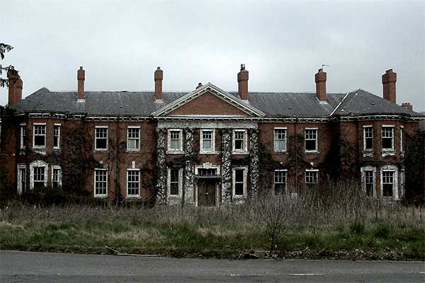
This was another idea for a location, this is west park
hospital in Epsom, it is located just down the road from Epsom train station,
it has the benefit for being perfect for our horror story as it used to be a
mental hospital. However this location has recently been demolished and no
longer has as many features as it use to have, this makes it unusable for our
film ideas, along with this problem it would have also been illegal again to
trespass although we could have probably emailed the relevant people to request
use of the site.


For our location we came to the decision to use 40 foot
recreation ground in Leatherhead as one of our location, this provides us with
several ideas such as a chase scene. Another location we are going to use the
house pictured, the film will be based on a murderer on the loose and he finds
and murders a group of friends in this house, these are likely to be our final
locations as we feel they would be most appropriate to the film.
Questionnaire
These are the questions we hope to ask our audience, there
responses will help us get a better understanding about the genre and what
people expect from horror movies. As well as this it will give us an idea about
who goes to see horror films as we recognise our target should be young adults,
however this Questionnaire could bring some surprise results.
1.What is your age and gender?
2. What would be your preferred location for a Horror film?
- A house
- A park
- A Forest
- A school
3.Would you prefer the Antagonist to be a person or a ghost
that cannot be seen?
4.What would you expect the Protagonist in the film to be
like?
5.What would you expect the Antagonist in the film to be
like?
6. What is you favourite sub-genre within Horror?
- Blood and gore
- Ghosts
- Thriller
- Psychological
7. What is your favourite horror film? and why?
8. Would you prefer the Antagonist to be realistic or to be
a character that is sub-normal?
9. Would you prefer if the Horror film is based on things
that actually occur? e.g. stalking murder etc
10. Do Horror films containing blood and gore appeal to you?
11. What would you expect to see in a horror trailer?
Wednesday, 5 November 2014
Costume Ideas
In our film idea we have 4 main characters, 3 "victims" and a murderer who is hunting them. The murderers costume will be most important as it needs to convey the evil nature of our antagonist in order to unsettle the audience and make him a credible threat. It would not make sense to have our murderer dressed in a hoodie and jeans and wearing trainers as a murderer must be psychopathic and therefore would not dress casually. Therefore the costume needs to convey to the audience the idea of the murderer being crazy and therefore be abnormal. We are already planning to have our murderer in some form of mask which will help to put across the idea of his lunacy and make him a credible threat. For the rest of his costume, we thought about him wearing black, muddy, worn-out work boots to as these would be conventional footwear for a killer to use. An example would be the character Zep from the original Saw film.
The rest of the killers costume would ideally be mostly black, which has the practical benefits of making them harder to identify in shots which we can use to our advantage in teasing the character to the audience in our trailer without fully revealing him. Black trousers, a black jacket and black gloves with the mask would make our killer look creepy and reveal almost nothing about him to the audience, further helping to make the character intriguing and terrifying.

For our victims, costume-work will be easier to decide on as there is a broader range of acceptable outfit. It is conventional for the victims in horror films to be relatable for the audience, making it easier to put yourself in their shoes and therefore making the scenario more frightening. This is why most of the time teenagers are the victims in these films as teenagers are the main target market for the horror genre. Our 3 victims will also be teenagers and will dress accordingly in t-shirts, hoodies and trainers. Ideally, most of the victims costumes will consist of bright colours like white in order to contrast with the darkness of the villain and to make them seem more vulnerable in a dark environment as they stand out more. Each costume should also be tailored to reflect each characters personality, helping to make them more identifiable to the audience. A good example is from the costume-work in The Cabin in The Woods, which can be seen below. You have the "jock" character wearing an American football jacket to show he is the strong, sporty and typically stupid one in the film. Then you also have the contrasting choice of costume for each of the female-characters, with the blonde woman wearing a short skirt and the ginger woman wearing jeans, making the audience sympathise more with the ginger woman as she seems more respectable and less promiscuous than the blonde woman.

We have also had an idea for a fake news report to feature in our trailer, with a news reporter setting the scene to the audience. If we end up going along with the news report idea, we would likely have our news reporter in a smart suit and tie to add to the realism, as this is typically what you'd expect to see in a real life news report.
Monday, 20 October 2014
Prop Research

The most commonly used props in a horror movie seem to be masks and weapon-focused. A hockey mask or some form of face-covering is stereotypical of the genre, adding to the fear the antagonist instills to the audience as their identity is hidden, raising enigmas. Famous examples include Mike Myers from the Halloween film franchise and Hannibal Lecter.
The mask is an effective prop for this genre as part of every horror is the build-up to the antagonists reveal, showing them gradually to the audience to create suspense and tension. With the use of the mask the suspense of the film is not deflated as soon as the villain is revealed to the audience, as there are still questions raised surrounding the man behind the mask, what he really looks like and why he is after the protagonists rather than showing the full picture straight away. This is why we are thinking of using some form of face-covering in our trailer, as this will allow us to show off our villain without giving to much away and still giving the audience
questions.
 Another key area for props in this genre is weapon-focused, normally what the antagonist uses to hunt down the protagonists. The most commonly used are knives (like Mike Myers, above), chainsaws (The Texas Chainsaw Massacre) and machetes (Friday the 13th), all weapons that would create a lot of blood and gore. This makes the antagonist a more credible threat and plays on audience fears of stabbing and obviously, dying.
Thursday, 16 October 2014
Magazine Cover Analysis #2

This is a cover for film magazine Empire, which is a limited edition cover promoting the James Bond film, Skyfall. The cover itself is simplistic, drained of most colour and showing an image of James Bond in a smart suit, holding a gun. The cover acts as a pure character cover, that's main aim is to introduce the character to the audience and does this by giving Bond prominence in the poster, taking up most of the available space. The image of Bond works to give the audience a clear idea of the characters personal traits. For example, the costume-work is used to show the sophisticated nature of the character, looking smart and perfectly clean whilst finding himself in a dangerous situation, which is highlighted by the prop of the gun which connotes action and violence (informing the audience of the genre).
However, the character is also displayed as a dark and moody person, which is represented to the reader by the complete lack of colour surrounding the character as well as the lighting used, with half of his face in the shadows. This also carries connotations linking with the characters occupation (therefore giving audiences a better idea of the films plot), as being a spy would mean working in the shadows and remaining unseen all the time. The only colour that is used in the cover is reserved for the title of the magazine and a small print telling the reader that this is a limited edition cover, which are both shown in a gold colour, from which the reader can infer the character is used to the finer things in life with the colour of gold connoting wealth and riches.
Locations are normally shown in poster and magazines covers to give the audience information about the film and to draw them in to want to see it, sometimes making the location one of the most prominent parts of the cover if it is one of the films main USP's. In this cover though it is the lack of information provided that would make the audience more intrigued. Instead the designer of the cover has opted for a plain white background in order to make the character stand out more. However, it is probably safe to assume that the audience of this magazine would be familiar with the Bond franchise and therefore more likely they would be familiar with the stereotypes of the typical Bond film, including the use of exotic locations. Here, none of the information regarding where the film is set is given, which would make audiences want to see the film even more.
Locations are normally shown in poster and magazines covers to give the audience information about the film and to draw them in to want to see it, sometimes making the location one of the most prominent parts of the cover if it is one of the films main USP's. In this cover though it is the lack of information provided that would make the audience more intrigued. Instead the designer of the cover has opted for a plain white background in order to make the character stand out more. However, it is probably safe to assume that the audience of this magazine would be familiar with the Bond franchise and therefore more likely they would be familiar with the stereotypes of the typical Bond film, including the use of exotic locations. Here, none of the information regarding where the film is set is given, which would make audiences want to see the film even more.
Magazine Cover Analysis #1

This is a cover from Empire magazine that shows a still from The Hobbit: An Unexpected Journey. The image they have used is of one of the main dwarf characters, Thorin. The image itself works to make the character seem powerful, with it being taken from a slightly lower perspective than the characters height in order to make the audience "look up" to the character. The costume also emphasises this trait as the fur coat he is wearing makes him look bigger and more masculine, which are stereotypical traits of the archetypal action hero. There is also a lot of metal armour that the character is wearing, which also puts danger and war in the audiences mind and gives the character questions the audience will want the answer to.
The layout of the cover is also interesting as the image comes before the magazine in that the name of the magazine is behind the characters head, making the film seem more important than the magazine itself, making audiences want to buy in order to see what makes this film so special. The falling snow that surrounds the character is made prominent to the reader as it suggests a cold atmosphere to the film, giving the audience a greater idea as to what the film will be like. This also gives the film stronger connections to the fantasy genre as opposed to the action genre, which audiences could be forgiven for misinterpreting as the films genre given the image of war and fighting that the armour would give across. This also helps in drawing in the key target audience of fantasy genre fans, particularly those unfamiliar with the Lord of the Rings franchise or those that simply do not know that this film serves as a prequel to that series.
The font used for the film title is bold and typed in white in order to make it stand out. The boldness of the font has connotations of confidence and simplicity, as if the name itself should entice readers without the need for any extra editing to draw the readers attention. This gives the film an air of grandiose importance. To give the target audience extra incentive to buy the magazine "the ultimate issue" is written in bold capital letters which gives the audience the impression that there is something special about this particular issue which should make them want to buy it, even if they are not regular purchasers of the magazine.
In Bruges Poster Analysis

This is a poster for 2008 dark comedy In Bruges, starring Colin Farrell and Ralph Fiennes. The poster shows the 3 main characters looking at the camera holing guns and ice creams. This lets the audience know the film is a mixture of action and comedy with the juxtaposition of the guns danger and the ice creams light-heartedness. There is also a swan in the background which adds to this effect of light-hearted almost over-the-top comedy.
The costume-work consists of dark clothing for all 3 characters reflecting the mood of the film. It can also be inferred from the way the main character is wrapping his arms around himself and by the big jackets they are all wearing that the film is set in a cold location, which the film has highlighted by naming Bruges in the title of the film (along with "It's in Belgium" written underneath). It also looks like there is light snow on the ground in the poster, reinforcing this to the audience. They may have chosen to do this because it is one of the films main USP's, with most other action films conventionally set in warm exotic locations. This is also shown by the city buildings in the background which also work to give the audience an idea of what Bruges is like.
The title itself is written in large pink text and placed in the middle of the poster, which works to make the title stand out to the audience and stand out from the rest of the poster. The tagline for the film is "shoot first, sightsee later," which further combines the elements of action and comedy to make it clear to the audience what the films genre is. This tagline is written in a white text and placed in front of the main characters black coat in order to make this stand out as well, showing its importance. The 3 main actors names are also shown and made to stand out in the top left hand corner of the poster by separating it from the rest of the text. This would have been done to make audiences aware of who is starring in the film as they are big name actors who the filmmakers will want to show off in order to draw in audiences.
Thursday, 2 October 2014
The Bourne Supremacy Poster Analysis

This is a poster for the 2004 action spy sequel The Bourne Supremacy,starring Matt Damon. The poster shows the lead character aiming with a sniper rifle with an exotic location shown behind him. The main purpose of this poster is to show off the actor to the audience, with Matt Damon being a big name in the action film genre with many fans, so simply showing him to be a part of the film will get a lot of people on board and wanting to see the film. This is why this is emphasised with "Matt Damon is Jason Bourne" written above the title, which also lets people know the main character.
The second main part of this poster would be the sniper rifle being held by the main character as the appearance of a weapon is an obvious link to the action genre, therefore uninformed audience members know what to expect from the film. The gun also makes the main character seem more powerful and a bigger threat, making the audience want to see what violence he gets involved in in the film. This also raises questions as to who he is pointing the gun at and for people who are unfamiliar with the franchise, whether he is protagonist or antagonist.
The tagline of the film is written in large writing at the top of the poster and made to stand out. "They should have left him alone," makes the audience question who "they" are as well as letting them know they can expect the character to be involved in conflict with other people, letting them know more of the films plot. The exotic location shown behind the character seems to show a European location such as Germany or Italy, which subverts the usual stereotype of mainstream action films being set in America. The poster works to make this obvious to the audience as the unusual location also acts as the films USP.
The tagline of the film is written in large writing at the top of the poster and made to stand out. "They should have left him alone," makes the audience question who "they" are as well as letting them know they can expect the character to be involved in conflict with other people, letting them know more of the films plot. The exotic location shown behind the character seems to show a European location such as Germany or Italy, which subverts the usual stereotype of mainstream action films being set in America. The poster works to make this obvious to the audience as the unusual location also acts as the films USP.
Bond Poster Analysis #2

This is the poster for 1995 James Bond film Golden-eye, starring Pierce Brosnan. The poster shows Bond pointing a gun towards the audience, with 2 women either side of him in revealing dresses. There is also a shot of Bond running away from an explosion with helicopters and jets behind him.
The poster lets the audience know straight away that it is a Bond film by having the 007 logo in a large gold font right in the centre of the poster. This lets the audience know straight away exactly what genre the film is and what franchise it belongs to. The gold colour used for the logo also links with the title. Bond is made to look like a typical action hero by the gun he is holding as well as the cold expression on his face. The 2 women are used to connote sex and romance which are clear stereotypes of any action film but are also specifically showing the audience who the "Bond girls" are for this entry in the franchise.
The title of the film is also made prominent on the poster so the audience knows what the film is called and is also a very interesting name that will have the audience wondering what it means. The part of the poster that shows Bond running away from the explosion also works to entice audience members into seeing the film as the explosion lets the audience know to expect large action set-pieces from this film, drawing in fans of that genre. The helicopters and planes are also stereotypical parts of chase scenes in action films so the audience knows to expect a chase scene in this film.
The Next 3 Days Poster Analysis

This is a poster for the 2010 thriller The Next Three Days starring Russell Crowe and Elizabeth Banks. The poster shows the main character looking contemplative with a still from the film shown inside his head. The character is shown in grey with not a lot of colour featuring on the poster, giving the audience the impression that the film will have a dark moody atmosphere which conforms with the archetypal thriller film. This also helps the release date stand out as the colour of the text is red, making sure the audience notices this important piece of information. The other key pieces of text that are made to stand out is the title and the films lead actor, both standing out by the size of the font used and both being made noticeable in order to entice the audience into seeing the film.
Russell Crowe is a well-known highly rated actor that would make fans of his want to see the film which is why the poster wants to make his name stand out in order to show off the films lead actor. The title is also important to make stand out as it raises enigmas for the audience. People will want to know why the film has been called The Next Three Days, what needs to happen in the next three days? The poster also features a tagline of "what if you had 72 hours to save everything you live for?," which also asks questions of the audience and lets them know a little more about the films plot in order to draw them in.
The still from the film that is used shows a man (presumably the lead character) and a woman running down an empty train platform with a bag. This serves to let the audience know the film has action in it and will help to make more audience members want to see the film if they enjoy action films. It also raises more questions for the audience as they will want to see the film to know who or what these people are running from. The bag the man is holding is also an interesting prop that also raises questions as to its contents as if you are running away from someone/something you would only be carrying absolute essentials or something of importance. Therefore the audience will want to know what is in the bag.
The last key piece of information the audience can infer from the poster is that the film is set in America, like most mainstream films nowadays. This can be read from the train station the man and woman are running through with the train clearly part of the American subway rather than a UK or European train. Most films with a big budget are set in America as they can afford to film there and this also carries an air of importance to the film that you would not get if it were set in a smaller country such as France (although Pour Elle, the film The Next 3 Days was based off of, was set in France) or England.
Thursday, 18 September 2014
Bond Poster Analysis #1

This is a poster for 2012 Bond film Skyfall. The poster shows James Bond leaning against an old-fashioned car, gun in hand, looking forlorn against a London backdrop. The costume-work in the poster is used to show the audience Bonds smart and sophisticated character with him wearing a suit and tie. This also reflects attire you would expect to see someone wearing for an everyday office job, which juxtaposes with the reality of the protagonists occupation of a secret service agent. The audience can infer from this that James Bond sees his job as ordinary, which reinforces the idea of him being brave as his job is far from ordinary and involves him being in danger constantly.
The gun Bond is holding serves to let the audience know the genre of the film is action, as without this the poster could be misconstrued as a drama what with the black and white being used and the character of the poster looking deep in thought. The gun is an easy way of informing the audience of the films action genre as a gun carries associations of violence, death and war which are all conventions of the action genre. The old-fashioned car Bond is leaning against could be used to remind the audience of classic Bond films, and let the audience know that this film will link to the those as this film was released during the 50th anniversary of the start of the franchise. However, it could also feature to further expand the audiences idea of the characters personal taste and class, with an interest in classic cars connoting experience and sophistication.
The houses of parliament that serve as a backdrop for the poster serves to let the audience know the setting of the film is London as this is a very famous landmark. It is important for a film such as this to let the audience know of the London setting as it serves as the films main USP, an action film set in London which subverts the stereotypes of action films normally being set in America or exotic locations in the world. The title of the film is shown by the prominence given to the word Skyfall, with it being the text closest to the centre of the poster. The name itself also serves to create an enigma as the name Skyfall gives little away about the film, which could make people want to see the film in order to find out the meaning behind its title. The 007 logo underneath the title contrasts with the rest of the poster as it is the only part of the poster to feature colour, with the gold writing drawing the audiences eye to let them know this film is a Bond film.
Monday, 30 June 2014
Subscribe to:
Comments (Atom)